Building an awesome responsive website
I’ve recently worked (and at the time of writing, still working) on a project that emphasises on the mobile user experience. Our client wanted a site that looks good and functions well on mobile devices, and works just as well on the desktop.
There are several approaches to developing for mobile users. You could provide device-specific templates, and have your web server serve the appropriate template based on the browser or device ID provided in the request header. This makes it easier to build templates that target specific devices, and provide the best user experience for those devices.
EPiServer has included a neat feature, called Display Channels, that does exactly. All you, as a developer, have to do is include the necessary templates, and you’re all set to serve your mobile users.
The problem with this approach is that your users will be stuck with whichever mode their devices support. For instance, users on higher resolution devices, such as the Retina display-equipped iPhones or the 1080p display-equipped Xperia Z, will be stuck with the mobile version of the website, despite having the capability to view higher resolution images as well as having ample space for additional content.
Another issue with this approach is fragmentation, since developers will obviously have to take care of the regular website, as well as the mobile version. This reduces maintainability because the developers will have to take care of two sets of code, instead of just one.
The alternative to this is to build a website that takes advantage of the size of display. The higher the resolution, the better the user experience will be - higher resolution images, additional content, etc. The website basically responds to the size of the viewable space, hence the name responsive design.
Responsive web design is nothing new, but it is increasing in popularity, especially with today’s ever increasing number of mobile internet users. So it’s important for front-end developers to harness the ability to work with responsive websites.
Here are my tips on building a good responsive website based on my experience.
Start small. Literally.
You should start off with the lowest resolution you’re supporting, such as the ones found on mobile phones. Set a minimum width, in pixels, and use that as your baseline. You can then set up a number of break points, slowly moving up towards the highest resolution, i.e. the desktop. This is called the mobile-first approach.
The reason for taking this approach is so you can avoid problems later on, like having buttons that are too small, or confusing markups, or having to undo CSS rules.
You can, of course, work on your current site, and gradually downscale it to look work on smaller devices. But experience has taught me that it’s always easier to add stuff in than taking them out. That’s why code refactoring often take a lot of time.
As for the content, you should start off with the least amount of content, focusing on the most critical parts of the site. If certain sections, or more importantly, images are not crucial to the current content, discard it. Your mobile users, especially the ones on strict data packet limits, will thank you.
As you start to work with higher resolutions, you will want to display more and more stuff on your site. However, you should be careful on what you decide to display on each resolution group. Ask yourself whether it’s actually necessary for you to include that highly sophisticated slideshow of high resolution images for your tablet users.
In our project, I decided to set up four break points for four different display modes - mobile, tablet portrait and landscape, and desktop. I also decided to hide all non-crucial sections of the site using CSS3 media queries. As for images, I’ve opted for a JavaScript solution that would load the images as they become necessary, also known as lazy loading.
Build a good responsive navigation.
Never underestimate the importance of a good navigation. I have found myself navigating away from a website simply because I found the site navigation poorly constructed and confusing to use.
On mobile devices, it makes sense to have larger menus, thumb-friendly-sized links and buttons. Menu items should be designed in such a way that your users are able to use it without having to zoom in, so consider making huge menu item links. You’re also not going to be needing the hover effect, seeing as how mobile users are less likely to have a mouse pointer to hover over links with.
You should also consider making them collapsible, especially if you’re planning to build a large menu, because a mobile screen is only so big, so it’s useful if the user can tuck the navigation links away to get to the good stuff.
As you expand your site for larger resolutions, you’ll find that you have more screen real estate to work with, and you can do with not collapsing your site navigation.
The challenge here really is figuring out the best way to build a one-code-fits-all solution for your navigation. Something that works fine as is, and that also works when you collapse it.
In our project, I created a simple collapsible site navigation that turns into a simple navigation when the screen is wide enough. The collapsible menu toggle is shown in mobile and tablet mode, and hidden in desktop mode. This is inspired by the responsive menu found in the Twitter Bootstrap framework.
Use native implementation whenever possible.
There will be instances where you’ll need to implement a form on your website, such as a simple feedback form, and you need to enter something like an email, date, or time. Back in the days, you’ll be presented with a standard text input field, where you’ll have to enter a data, or time, and have some validation tell you it’s the wrong format.
HTML5 has introduced several new input controls, such as email, date and time, and many mobile browsers as well as desktop browsers have native implementations for them. Native implementations allow users to easily enter values using the device’s native input method, as well as provide some basic validation.
Unfortunately, native implementation is not available across all browsers, and some implementations are somewhat flaky if not useless. As such, fallbacks and polyfills are required. So be sure to include these for those less fortunate than yourself. You can use a script loader, such as yepnope.js and Modernizr, to conditionally load up the required fallbacks.
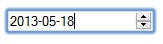
In our project, we tried to leverage the native implementations for date and time fields, but while this looks and works great on mobile browsers, it was rather inconsistent across desktop browsers. Chrome and Opera had proper native implementations which included a nice popup calendar for the date field, but while Safari was detected as having support for the date input type, its implementation was less than useful. In Firefox, support for the date and time input types was missing altogether.
Chrome datepicker
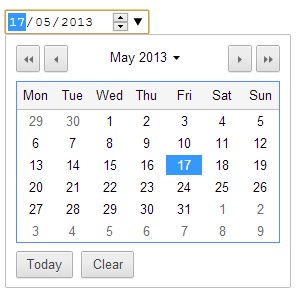
Opera datepicker

Safari has no datepicker
So I did what any decent front-end developer would do in this situation, I ditched it and went with a JavaScript implementation. It’s sad, but I’m a big believer in creating cross-browser-ly consistent UIs.
Use Scalable Vector Graphic (SVG) whenever possible.
Scalable Vector Graphics, or SVGs, are great for responsive websites. Imagine having to create a separate image for every mode your site is supporting, and then discovering that it still looks horrible on Retina display-equipped devices.
Blown up PNG logo

Blown up SVG logo

With SVGs, you no longer have to worry about this. Since SVGs are essentially letters and numbers, the browser will do the rendering. Also, depending on how complex the image is, chances are SVG files are more likely to be smaller than your average high definition PNGs.
Of course, let us not forget about those of us who are less fortunate, and have to use older browsers that don’t support SVGs. You should always provide a fallback for such scenarios. A simple one-liner such as the one below will do.
<img src="site-logo.svg" alt="Site logo" onerror="this.onerror=null;this.src='site-logo.png';" />
You can also do the same for background images, using CSS of course.
In our project, we used SVG for any images that needs to be scaled, such as the site logo, menu icons, and the search icon. We’re currently using the PNG images for static decorators, but slowly moving towards converting them to SVGs as well.
Drawbacks
There are, of course, drawbacks to responsive design. They’re not that significant, and can safely be ignored given the right approach, but they are still drawbacks.
-
Contents meant for larger displays are simply “turned off” using CSS. They’re still there, just hidden away. This causes unnecessary downloads. But as I’ve already mentioned in this post, you can over come this using some form of JavaScript lazy loading, at least for the images.
-
There’s no way to change the order of the markup, meaning everything needs to be done through CSS. There’s no way to completely remove any particular elements from the markup. You can only hide them. That’s why it’s important to take this into consideration when working on your design.
Finally, the points I’ve mentioned here are really stuff I’ve come across. They are by no means the one and only way to building an awesome responsive website, as I’m sure there are many other great tutorials on this topic. Take it with a pinch of salt, and have fun building your responsive website.
Wassalam